Back to Projects

Defining the Visual Language for TasteVoyage

Explore how TasteVoyage's visual identity was crafted through thoughtful brand values, personality, and design elements to create a cohesive and engaging user experience.

Role

Product Designer

Timeline

3 Weeks

Tools

Figma, Pen Tool

Overview

In this project, I built the visual foundation for TasteVoyage, a culinary travel platform. I brought the brand to life through thoughtful design choices. Everything was designed to reflect the brand’s values and create a cohesive, scalable experience that feels both authentic and inviting.

Challenge

How might I create a mobile experience that feels fun and effortless for users to explore food adventures while keeping the design system consistent, scalable, and developer-friendly behind the scenes?

Solution

The TasteVoyage Style Guide provides a foundational visual framework to ensure a consistent brand experience across all touch points. This comprehensive guide serves as the essential first step in building a scalable design system, allowing for seamless future expansion and adaptability.

Research

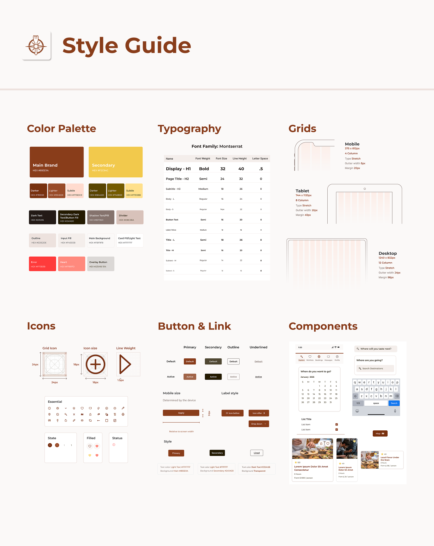
To begin developing the visual identity of TasteVoyage, I analyzed four competitors, like EatWith and Airbnb Experiences to understand the strengths and gaps in their visual language. This analysis helped me identify opportunities for TasteVoyage to reflects its unique focus on local, curated food experiences. After analyzing competitors, I created a moodboard to explore the visual direction for TasteVoyage, focusing on warm, earthy tones with subtle color pops to reflect the brand’s inviting and authentic feel. I pulled inspiration from successful brands like Airbnb and Uber for icon design and text hierarchy, and referenced Airbnb’s design system foundations to guide scalable, consistent visual decisions.

No items found.

Process

To further guide the visual direction of the brand, I identified TasteVoyage’s core values and brand personality. This helped ensure that every design decision, from color to typography to tone, aligned with the brand’s deeper purpose and how it should feel to users.

No items found.

I designed the system to be clean, consistent, and easy to use, both for users and the team building it. I reused key components like buttons, cards, and navigation to keep everything feeling unified, and made sure everything was clearly organized and documented. That way, whether you’re a designer or a developer, it’s easy to pick up and run with.

No items found.

Results

I was able to create a design that’s easy to use and feels natural, with simple navigation and a cohesive look. Feedback from both peers and users showed that the search flow was clear, the colors and typography were warm and welcoming, and the overall experience was smooth. The straightforward layout made it easy for users to dive in and start using the app, helping me achieve my goal of creating an enjoyable and efficient experience.

Reflection

While working on this project, I was reading Laying the Foundations by Andrew Couldwell to learn more about design systems. It helped me see just how important it is to build a strong foundation early on, something that really reminded me of lesson planning from my teaching days. I also revisited my icons, which originally came from a community library, and decided to redesign them using Figma’s pen tool so they felt more cohesive with the rest of the brand.

Tags

Visual Design

Brand Identity

Accessibility Design

Design Systems

Brand Strategy

Let’s Work Together

Have a project in mind? I’d love to hear from you!

Thank you! Your submission has been received!
Oops! Something went wrong while submitting the form.

Additional Work

Back to Projects